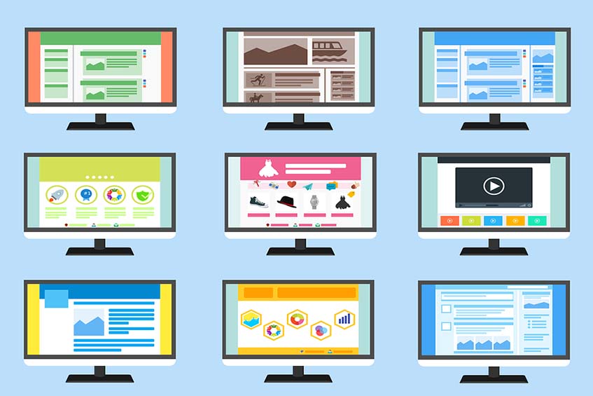
To impress online visitors, your website should not have any glitches or loading issues and should also be appealing. If your site doesn’t appeal to a visitor, you might never see them again.
The following are things you should avoid when designing a website:
404 Errors
This is the worst thing that can happen when your site opens. Links that aren’t loading properly or working will present this error and this means that you've lost a potential customer for good. To avoid 404 errors, carry out daily tests on your site to confirm that the links are working properly.
Navigation Speed
Just because your target audience uses high-speed internet doesn’t mean that a website will load faster on their end. Your site should have a navigation bar at the top of your site to make it easy for visitors to navigate through pages instead of loading previous pages.
Lack of Proper Info
Your site should have an address, phone number and email clearly laid out on the contacts page. Users should not have to scavenge your site looking for contact info.
Social Media
Your site should have at 3-5 social media links for promotion on different platforms.
Disabled Buttons and Pop-ups
Pop-ups are outright annoying and if your site has them, you are scaring potential clients away. Avoid them at all costs.
Also, the back button should never be disabled when someone opens your site - this would make them close the tab altogether.
Set up analytics on your site as the information will help you detect something that is not right and act fast to fix the problem before it worsens.
Now that you have the information to know what to avoid, get creative and develop a good design for your website but if things don’t work out, call us and we will help.
